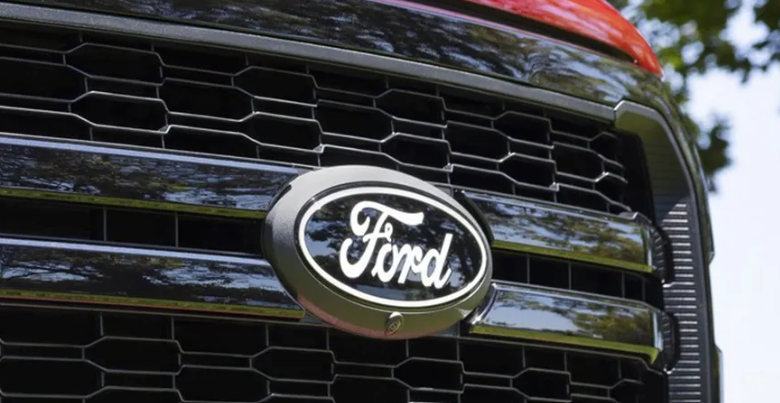
In recent years, there has been a noticeable Ford trend in car logos. Gradually, many major car manufacturers have moved away from the gradients and three-dimensional elements that were added in previous decades in favor of cleaner, flatter designs. The iconic script-based Ford logo, one of the few remaining holdouts, appears to have finally embraced this trend.
Ford has introduced a refreshed version of the F-150, featuring a new Ford emblem. However, the change was not formally announced, so some individuals might not immediately notice it. The updated design moves away from the chrome aesthetic of the previous logo and incorporates a slightly larger rendition of the script with clean white accents. This design may appear familiar because it closely resembles the classic logo used in the 1960s. Despite the understated update, it continues to hold a well-deserved place among the finest cursive logos and prominent brand logos.
Ford
The fresh emblem preserves the timeless stylized Ford script that has been in use in various iterations since it was created by the company’s inaugural chief engineer, Childe Harold Wills, in 1909. The familiar oval, initially introduced in 1912, remains a key element. However, the design has been streamlined to closely resemble its appearance after the renowned designer Massimo Vignelli’s reworking of it in the 1960s.
The recent changes to the Ford logo include the replacement of the chrome finish and outer border with a plain white one, along with the removal of the inner border. These adjustments permit a slight enlargement of the text to occupy the space more effectively. The updated design might not come as a major surprise. In fact, it’s somewhat surprising that Ford took this long to align with the prevailing trend in logo design, a trend that has elicited mixed reactions (check out our roundup of car logo redesigns, both good and not-so-good). However, given the high recognition factor associated with the Ford logo, it was a wise decision not to introduce a more radical alteration.
READ MORE AUTO NEWS


